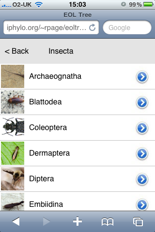
However, I've spent the last couple of days playing with it in order to build a simple tree navigating widget, which you can view at http://iphylo.org/~rpage/eoltree/.
The widget resembles Aaron Thompson's Taxonomy (formerly called KPCOFGS) iPhone app in that it uses the iPhone table view to list all the taxa at a given level in a taxonomic tree. Clicking on a row in this table takes you to the descendants of the corresponding taxon, clicking "Back" takes you back up the tree. if you've reached a leave node (typically a species) the widget displays a snippet of information about that taxon. It also resembles Javier de la Torre's taxonomic browser written in Flex.
Here's a screen shot of the widget running in a desktop web browser:

Here's the same widget in the iPhone web browser:
 Using the API
The EOL API is pretty straightforward. I call the http://www.eol.org/api/docs/hierarchy_entries API to get the tree rooted at a given node, then populate each child of that node using http://www.eol.org/api/docs/pages. The result is a simple JSON file that I cache locally to speed up performance and avoid hitting the EOL servers for the same information. because I'm locally caching the API calls I need a couple of PHP scripts to do this, but everything else is HTML and Javascript.
iPhone and iPad
I've not really developed this for the iPhone. I've cobbled together some crude Javascript to simulate some iPhone-like effects, but if I was serious about the phone I'd look into one of the Javascript kits available for iPhone development. However, I did want something that was similar in size to the iPhone screen. The reason is I'm looking at adding taxonomic browsing to the geographic browser I described in the post Browsing a digital library using a map, so I wanted something easy to use but which didn't take up too much space. In the same way that the Pygmybrowse tree viewer I played with in 2006 was a solution to viewing a tree on a small screen, I think developing for the iPhone forces you to strip things down to the bare essentials.
I'm also keeping the iPad in mind. In portrait mode some apps display lists in a popover like this:

This popover takes up a similar amount of screen space to the entire iPhone screen, so if I was to have a web app (or native app) that had taxonomic navigation, I'd want it to be about the size of the iPhone.
Let me know what you think. Meantime I need to think about bolting this onto the map browser, and providing a combined taxonomic and geographic perspective on a set of documents,