Showing posts with label Google Maps. Show all posts

Sunday, January 02, 2022

Large graph viewer experiments

I keep returning to the problem of viewing large graphs and trees, which means my hard drive has accumulated lots of failed prototypes. Inspired by some recent discussions on comparing taxonomic classifications I decided to package one of these (wildly incomplete) prototypes up so that I can document the idea and put the code somewhere safe.

Google Maps-like viewer

I've created a simple viewer that uses a tiled map viewer (like Google Maps) to display a large graph. The idea is to draw the entire graph scaled to a 256 x 256 pixel tile. The graph is stored in a database that supports geospatial queries, which means the queries to retrieve the individual tiles need to display the graph at different levels of resolution are simply bounding box queries to a database. I realise that this description is cryptic at best. The GitHub repository https://github.com/rdmpage/gml-viewer has more details and the code itself. There's a lot to do, especially adding support for labels(!) which presents some interesting challenges (levels of detail and generalization). The code doesn't do any layout of the graph itself, instead I've used the yEd tool to compute the x,y coordinates of the graph.

Since this exercise was inspired by a discussion of the ASM Mammal Diversity Database, the graph I've used for the demonstration above is the ASM classification of extant mammals. I guess I need to solve the labelling issue fairly quickly!

Sunday, August 20, 2017

Notes on displaying big trees using Google Maps/Leaflet

Notes to self on web map-style tree viewers. The basic idea is to use Google Maps or Leaflet to display a tree. Hence we need to compute tiles. One approach is to use a database that supports spatial queries to store the x,y coordinates of the tree. When we draw a tile we compute the coordinates of that tile, based on position and zoom level, do a spatial query to extract all lines that intersect with the rectangle for that tile, and draw those.

A nice example of this is Lifemap (see also De Vienne, D. M. (2016). Lifemap: Exploring the Entire Tree of Life. PLOS Biology, 14(12), e2001624. doi:10.1371/journal.pbio.2001624).

It occurs to me that for trees that aren't too big we could do this without an external database. For example, what if we used a Javascript implementation of an R-tree, such as imbcmdth/RTree or its fork leaflet-extras/RTree. So, we could compute the coordinates of the nodes in the tree in "geographic" space, store the bounding box for each line/arc in an R-tree, then query that R-tree for lines that intersect with the bounding box of the relevant tile. We could use a clipping algorithm to only draw the bits of the lines that cross the tile itself.

Web maps, at least in my experience, make trips to a tile server to fetch a tile, we would want instead to call a routine within our web page, because all the data would be loaded into that page. So we'd need to modify the tile creating code.

The ultimate goal would be to have a single page web app that accepts a Newick-style tree and converts into a browsable, zoomable visualisation.

Wednesday, September 23, 2015

Visualising big phylogenies (yet again)

Inspired in part by the release of the draft tree of life (doi:10.1073/pnas.1423041112 by the Open Tree of Life, I've been revisiting (yet again) ways to visualise very big phylogenies (see Very large phylogeny viewer for my last attempt).

My latest experiment uses Google Maps to render a large tree. Googletree 
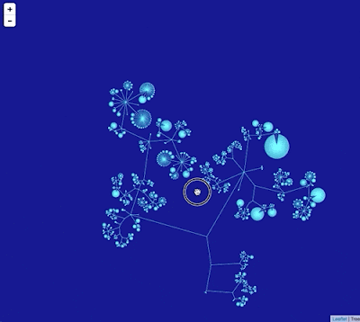
Google Maps uses "tiles" to create a zoomable interface, so we need to create tiles for different zoom levels for the phylogeny. To create this visualisation I did the following:

  1. The phylogeny laid out in a 256 x 256 grid.
  2. The position of each line in the drawing is stored in a MySQL database as a spatial element (in this case a LINESTRING)
  3. When the Google Maps interface needs to display a tile at a certain zoom level and location, a spatial SQL query retrieves the lines that intersect the bounds of the tile, then draws those using SVG.
Hence, the tiles are drawn on the fly, rather than stored as images on disk. This is a crude proof of concept so far, there are a few issues to tackle to make this usable:
  1. At the moment there are no labels. I would need a way to compute what tables to show at what zoom level ("level of detail"). In other words, at low levels of zoom we want just a few higher taxa to be picked out, whereas as we zoom in we want more and more taxa to be labelled, until at the highest zoom levels we have the tips individually labelled.
  2. Ideally each tile would require roughly the same amount of effort to draw. However, at the moment the code is very crude and simply draws every line that intersects a tile. For example, for zoom level 0 the entire tree fits on a single tile, so I draw the entire tree. This is not going to scale to very large trees, so I need to be able to "cull" a lot of the lines and draw only those that will be visible.
In the past I've steered away from Google Maps-style interfaces because the image is zoomed along both the x and y axes, which is not necessarily ideal. But the tradeoff is that I don't have to do any work handling user interactions, I just need to focus on efficiently rendering the image tiles.

All very crude, but I think this approach has potential, especially if the "level of detail" issue can be tackled.

Thursday, January 22, 2015

GeoJSON and geophylogenies

For the last few weeks I've been working on a little project to display phylogenies on web-based maps such as OpenStreetMap and Google Maps. Below I'll sketch out the rationale, but if you're in a hurry you can see a live demo here: http://iphylo.org/~rpage/geojson-phylogeny-demo/, and some examples below.

The first is the well-known example of Banza katydids from doi:10.1016/j.ympev.2006.04.006, which I used in 2007 when playing with Google Earth.

Banza

The second example shows DNA barcodes similar to ABFG379-10 for Proechimys guyannensis and its relatives.

Barcode

Background

People have been putting phylogenies on computer-based maps for a while, but in most cases these have required stand-alone software, such as Google Earth, or GeoJSON for encoding geographic information. Despite the obvious appeal of placing trees in maps, and calls for large-scale geophylogeny databases (e.g., do:10.1093/sysbio/syq043), computerised drawing trees on maps has remained a bit of a niche activity. I think there are several reasons for this:

  1. Drawing trees on maps needs both a tree and geographic localities for the nodes in the tree. The later are not always readily available, or may be in different databases to the source of phylogenetic data.
  2. There's no accepted standard for encoding geographic information associated with the leaves in a tree, so everyone pretty much invents their own format.
  3. To draw the tree we typically need standalone software. This means users have to download software, instead of work on the web (which is where all the data is).
  4. Geographic formats such as KML (used by Google Earth) are not particularly easy to store and index in databases.

So there are a number of obstacles to making this easy. The increasing availability of geotagged sequences in GenBank (see Guest post: response to "Putting GenBank Data on the Map"), especially DNA barcodes, helps. For the demo I created a simple pipeline to take a DNA barcode, query BOLD for similar sequences, retrieve those, align them, build a neighbour joining tree, annotate the tree with latitude and longitudes, and encode that information in a NEXUS file.

To layout the tree on a map (say OpenStreetMap using Leaflet or Google Maps) I convert the NEXUS file to GeoJSON. There are a couple of problems to solve when doing this.Typically when drawing a phylogeny we compute x and y coordinates for a device such as a computer screen or printer where these coordinates have equal units and are linear in both horizontal and vertical dimensions. In web maps coordinates are expressed in terms of latitude and longitude, and in the widely-used Web Mercator projection the vertical axis (latitude) is non-linear. Furthermore, on a web map the user can zoom in and out, so pixel-based coordinates only make sense with respect to a given zoom level.

To tackle this I compute the layout of the tree in pixels at zoom level 0, when the web map comprises a single "tile".

Tile

The tile coordinates are then converted to latitude and longitude, so that they can be placed on the map. The map applications take care of zooming in and out, so the tree scales appropriately. The actual sampling localities are simply markers on the map. Another problem is to reduce the visual clutter that results from criss-crossing lines connecting connecting the tips of the tree and the associated sampling localities. To make the diagram more comprehensible, I adopt the approach used by GenGIS to reorder the nodes in the tree to minimise the crossings (see algorithm in doi:10.7155/jgaa.00088). The tree and the lines connecting it to the localities are encoded as "LineString" objects in the GeoJSON file.

There are a couple of things which could be done with this kind of tool. The first is to add it as a visualisation to a set of phylogenies or occurrence data. For example, imagine my "million barcode map" having the ability to display a geophylogeny for any barcode you click on.

Another use would be to create a geographically indexed database of phylogenies. There are databases such as CouchDB that store JSON as a native format, and it would be fairly straightforward to consume GeoJSON for a geophylogeny, ignore the bits that draw the tree on the map, and index the localities. We could then search for trees in a given region, and render them on a map.

There's still some work to do (I need to make the orientation of the tree optional and there are some edges case that need to be handled), but it's starting to reach the point when it's fun just to explore some examples, such as these microendemic Agnotecous crickets in New Caledonia (data from doi:10.1371/journal.pone.0048047 and GBIF).

Cricket

Thursday, April 10, 2014

User interface to edit a point location

Circle
Following on from earlier posts on annotating biodiversity data (Rethinking annotating biodiversity data and More on annotating biodiversity data: beyond sticky notes and wikis) I've started playing with user interfaces for editing data.

For example, here's a simple interface to edit the location of a specimen or observation (inspired by the iNaturalist observation editor). You can play with this below or on on bl.ocks.org, and the source code is on GitHub https://gist.github.com/rdmpage/9951904.


Monday, March 10, 2014

Displaying a million DNA barcodes on Google Maps using CouchDB

BarcodeFollowing on from the previous post on putting GBIF data onto Google Maps, I'm now going to put DNA barcodes onto Google Maps. You can see the result at http://iphylo.org/~rpage/bold-map/, which displays around 1.2 million barcodes obtained from the International Barcode of Life Project (iBOL) releases. Let me describe how I made it.

Tiles


Typically when people put markers on a Google Map it is done in Javascript using the Google Maps API, and all the work is done by the browser. This works well if you haven't got too many points, but once you have more than, say, a few hundred, the browser struggles to cope. Hence, for something like GBIF or DNA barcodes where we have millions of records we need a different approach. In the GBIF data example I discussed previously I used tiles supplied by GBIF. Tiles are the basis of the "slippy maps" used by Google and others to create the experience of beig able to zoom in and out at any point on the map. At any time, the map you see in the web browser is made up of a small number of images ("tiles") that are typically 256 × 256 pixels in size. At the lowest zoom level (0) the world is represented by a single tile:

WorldTile
If you zoom in to the next level (1), the world now covers 41=4 tiles, zoom in again and the world now covers 42 = 16 tiles, and so on.

TileCoordinates
At each zoom level the tiles cover a smaller part of the world, and have increasing detail, so the user has the experience of zooming in closer and closer to an ever larger and more detailed map. But the browser only ever has to display enough 256 × 256 pixel tiles to fill the browser window.

Not only can we have tiles for the map of the world, we can also have tiles for data that we want to display on that map. For example, GBIF can create tiles for the hundreds of millions of occurrences in its database, so what looks like a giant map of millions of records is actually just a set of 256 x 256 tiles coloured to represent the number of records at each position on the tile.

DNA Barcodes


I wanted to make a map for DNA barcodes, but unfortunately there aren't any tiles I can use to create the map. So, I set about making my own. Here's what I did. Firstly, I downloaded the DNA barcode data from the BOLD site, and put the barcodes into a CouchDB database hosted by Cloudant. I simply parsed the tab-delimited data files and created a JSON document for each barcode, and stored that in CouchDB.

I then created a view in CouchDB that generated data for each tile. Each zoom level has its own tiles (for zoom level n there are 4n tiles). There's a nice web page on the Open Street Map wiki that describes how to compute slippy map tilenames. Here's the code I use to generate the CouchDB view:


function(doc) {
var tile_size = 256;
var pixels = 4;

if (doc.lat && doc.lon) {

for (var zoom = 0; zoom < 7; zoom++) {

var x_pos = (parseFloat(doc.lon) + 180)/360
* Math.pow(2, zoom);
var x = Math.floor(x_pos);

var relative_x = Math.round(tile_size * (x_pos - x));

var y_pos = (1-Math.log(Math.tan(parseFloat (doc.lat)
* Math.PI/180) + 1/Math.cos(parseFloat(doc.lat)
* Math.PI/180))/Math.PI)/2
* Math.pow(2,zoom);
var y = Math.floor(y_pos);
var relative_y = Math.round(tile_size * (y_pos - y));

relative_x = Math.floor(relative_x / pixels) * pixels;
    relative_y = Math.floor(relative_y / pixels) * pixels;

var tile = [];
tile.push(zoom);
tile.push(x);
tile.push(y);
tile.push(relative_x);
tile.push(relative_y);

emit(tile, 1);
}
}
}

For each zoom level that I support (0 to 6) I convert the latitude and longitude of the DNA barcode sample into the coordinates of the corresponding 256 × 256 tile. I then compute the position of the sample within that tile. This is rounded to the nearest 4 pixels, which is the size of marker I've chosen to display. As an example, the barcode AMSF292-10.COI-5P has location latitude -77.8064, longitude 177.174, which for a zoom level of 6 places it in tile [63,54].

To display the marker I also need to know where in the 256 × 256 tile I should draw the marker. Coordinates in tiles start at the top left corner:

PixelCoordinates
For the example above, the marker would be at x = 124, y = 200. This means that this barcode would have a key of [6, 63, 54, 124, 200] in the CouchDB view computed above. If we ignore the position within the tile, then this barcode belongs on tile [6, 63, 54].

To display the barcodes I added a layer to the Google Map. Whenever a map tile is drawn by Google maps, it calls a simple web service I created, and sends to that service the zoom level and tile coordinates for the tile it wants to draw. I then lookup that key [zoom, x, y] in CouchDB, and return all the points within that tile as a 256 x 256 SVG image. Google Maps then draws that over its own tile, and as a result the user sees both the Google Map and the location of the barcodes. To keep things manageable I only generate tiles down to zoom level 6. After that, the barcodes simply disappear.

So, with some fairly trivial coding, I've created a map tile server in CouchDB that displays over a million barcodes in Google Maps.

Barcodebig

Hit testing


Of course, a map by itself is a bit boring. What you want to do is be able to click on a point and get some more information. If you are using the Google Maps API to add markers, then it's pretty easy to handle user clicks and do something with them. But because I'm using tiles I can't use that approach. Instead what I do is capture any clicks on the map, convert that click to tile coordinates, then query CouchDB to see if any barcodes full within that location. If so, I display them down the right side of the map. It's a bit finicky about where you click on the map, but seems to work. It would be fun to extend this approach to the GBIF map, so that you could click on a point and see what GBIF says is there.

Summary


This is all a bit crude, but as far as I'm aware this is the only interactive map of all DNA barcodes (at least, the publicly available animal barcodes). There's a lot more that could be done with this, but for now it's functional. Take it for a spin at http://iphylo.org/~rpage/bold-map/, I'd welcome any comments. If you are curious about the technical details, the source code is on GitHub at https://github.com/rdmpage/bold-map.

Friday, March 07, 2014

GBIF data overlayed on Google Maps

SquareAs part of a project exploring GBIF data I've been playing with displaying GBIF data on Google Maps. The GBIF portal doesn't use Google Maps, which is a pity because Google's terrain and satellite layers are much nicer than the layers used by GBIF (I gather there are issues with the level of traffic that GBIF receives is above the threshold at which Google starts charging for access).

But because the GBIF developers have a nice API it's pretty easy to put GBIF data on Google maps, like this (the map is live):


The source code for this map is available as a gist, and you can see it live above, and at http://bl.ocks.org/rdmpage/9411457.

Friday, October 12, 2012

Mapping evolutionary biology: @evoldir and #ProjectEvoMap

Robert M. Griffin (@GriffinEvo) has launched ProjectEvoMap. Rob explains:
I have decided this week to try to create a resource where evolutionary
biologists can find info on labs and groups from all around the world. I
have created a collaborative Google map online which evolutionary biology
research groups can pin their labs to with a brief description of their
interests. Others can then browse the map to look for labs in specific
areas – for example, if someone wants to find suitable labs in their
current country for work they can see all the labs in that area, likewise
anyone looking for work in a specific region or who needs access to labs
while on fieldwork can look for nearby groups which may be able to help.

Below is a screen shot of part of the map. If you're working on evolutionary biology now is your chance to literally put your lab on the map.

Project
In parallel I'm experimenting with adding a map to the venerable EvolDir mailing list, for which I run a twitter stream (@evoldir). Using some terribly crude code to extract what looks like an address from EvolDir posts, then calling Google's Geocoding API results in a map of recent posts. You can see the live map at http://bioguid.info/services/evoldir/. This service compliments Rob's by giving a sense of current activity in the community (e.g., conferences, courses, jobs).

Evoldir

Friday, February 25, 2011

Deep zooming a large 2D tree

Here's a quick demo of a 2D large tree viewer that I'm working on. The aim is to provide a simple way to view and navigate very large trees (such as the NCBI classification) in a web browser using just HTML and Javascript. At the moment this is simply a viewer, but the goal is to add the ability to show "tracks" like a genome browser. For example, you could imagine columns appearing to the right of the tree showing you whether there are phylogenies available for these taxa in TreeBASE, images from Wikipedia, sparklines for sequencing activity over time, etc. I'll blog some more on the implementation details when I get the chance, but it's pretty straightforward. Image tiles are generated from SVG images of tree using ImageMagick, labelling is applied on the fly using GIS-style queries to a MySQL database that holds the "world coordinates" of the nodes in the tree (see discussion of world coordinates on Google's Map API pages), and the zooming and tile fetching is based on Michal Migurski's Giant-Ass Image Viewer. Once I've tidied up a few things I'll put up a live demo so people can play with it.

Friday, September 03, 2010

Viewing scientific articles on the iPad: browsing articles

touchevents.pngIn previous articles I've looked at how various apps display scientific articles. The apps I looked at were:

So, where next? As Ian Mulvany noted in a comment on an earlier post, I haven't attempted to summarise the best user interface metaphors for navigation. Rather than try and do that in the abstract, I'd like to create some prototypes to play with various ideas. The Sencha Touch framework looks a good place to start. It's web-based, so things can be prototyped rapidly (I'm not going to learn Objective C anytime soon). There's a moderately steep learning curve, unless you've written a lot of Javascript (I've done some, but not a lot), but it seems to offer a lot of functionality. Another advantage of developing a web app is that it keeps the focus on making the content accessible across devices, and using the web as the means to display and interact with content.

Then there is also the issue (in addition to displaying an individual article) of how to browse and find articles to view. Here are some possibilities.

Publisher's stream
Apps such as the Nature app and the PLos Reader provide you with a stream of articles from a single publisher. This is obviously a bit limiting for the reader, but might have some advantages if the publisher has specifically enhanced their content for devices such as the iPad.

Personal library
Apps such as Mendeley and Papers provide articles from your personal library. These are papers you care about, and one you may make active use of.

Social
Social readers such as Flipboard show the power of bringing together in one place content derived from social streams, such as Twitter and Facebook, as well as curated sources and publisher streams. Mendeley and other social bookmarking services (e.g., CiteULike, Connotea) could be used to provide social similar streams of papers for an article viewer. Here the goal is probably to find out what papers people you know find interesting.

Spatialipadmap.png
In an earlier post I used a map to explore papers in my BioStor archive. This would be an obvious thing to add to an iPad app, especially as the iPad knows where you are. Hence, you could imagine browsing papers about areas that are near you, or perhaps by authors near you. This would be useful if, say, you wanted to know about ecological or health studies of the area you live in. If the geographic search was for people rather than papers, you could easily discovering what kind of research is published by universities or other research bodies that are near your current location.

Of course, Earth is not the only thing we can explore spatially. Google maps can display other bodies in the solar system, (e.g., Mars), as well as the night sky. Imagine being interested in astronomy and being able to browse papers about specific planetary or stellar objects. Likewise, genomes can be browsed using Google maps-inspired browsers (e.g., jBrowse), so we could have an app where you could easily retrieve articles about a particular gene or other region of a genome.

Categories
Another way to browse content is by topic. Classifying knowledge into categories is somewhat fraught, but there are some obvious wasy this could be useful. A biologist might want to navigate content by taxonomic group, particularly if they want to browse through the 1000's of articles published in a journal such as Zootaxa (hence my experiments on browsing EOL). Of course, a tree is not the only way to navigate hierarchical content. Treemaps are another example, and I've played with various versions in the past (see here and here).

qt.png

I have a love-hate relationship with treemaps, but some of the most interesting work I've seen on treemaps has been motivated by displaying information on small screens, e.g. "Using treemaps to visualize threaded discussion forums on PDAs" (doi:10.1145/1056808.1056915).

Summary
These notes list some of the more obvious ways to browse a collection of articles. It would be fun to explore these (and other approaches) in parallel with thinking about how to display the actual articles. These two issues are related, in the sense that the more metadata we can extract from the articles (such as keywords, taxonomic names and other named entities, geographic localities, etc.) the richer the possibilities for finding our way through those articles.

Tuesday, August 24, 2010

Browsing a digital library using a map

Every so often I revisit the idea of browsing a collection of documents (or specimens, or phylogenies) geographically. It's one thing to display a map of localities for single document (as I did most recently for Zootaxa), it's quite another to browse a large collection.

Today I finally bit the bullet and put something together, which you can see at http://biostor.org/maps/. The website comprises a Google Map showing localities extracted from papers in BioStor, and a list of the papers that have one or more points visible on the map.

mapbrowser.png


In building this I hit a few obstacles. The first is the number of localities involved. I've extracted several thousand point localities from articles in BioStor. Displaying all these on a Google Map is going to be tedious. Fortunately, there's a wonderful library called MarkerCluster, part of the google-maps-utility-library-v3 that handles this problem. MarkerCluster cluster together markers based on zoom level. If you zoom out the markers cluster together, as you zoom in these clusters will start to resolve into their component points. Very, very cool.

The second challenge was to have the list of references update automatically as we move around or zoom in and out on the map. To do this I need to know the bounding box currently being displayed in the map, I can then query the MySQL database underlying BioStor for the localities within the bounding box, using MySQL's spatial extensions. The query is easy enough to implement using ajax, but the trick was knowing when to call it. Initially, listening for the bounds_changed event seemed a good idea. However, this event is fired as the map is being moved (i.e., if the user is panning or dragging the map a whole series of bounds_changed events are fired), whereas what I want is something that signals that the user has stopped moving the map, at which point I can query the database for articles that correspond to the region that map is currently displaying. Turns out that the event I need to listen for is idle (see Issue 1371: map.bounds_changed event fires repeatedly when the map is moving), so I have a function that captures that event and loads the corresponding set of articles.

Another "gotcha" occurs when the region being viewed crosses longitude 180° (or -180°) (see diagram below from http://georss.org/Encodings).

179-rule.jpg


In this case the polygon used to query MySQL would be incorrectly interpreted, so I create two polygons, each with 180° or -180° as one of the boundaries, and merge the articles with points in either of those two polygons.

I've made a short video showing the map in action. Although I've implemented this for BioStor, the code is actually pretty generic, and could easily be adapted to other cases where we want to navigate through a set of objects geographically.


Tuesday, August 11, 2009

Wikispecies RSS feed

Following on from my previous post about Wikispecies (which generated some discussion on TAXACOM) I've played some more with Wikispecies.

AS a first step I've added a Wikispecies RSS feed to my list of RSS feeds. This feed takes the original Wikispecies RSS feed for new pages (generated by the page Special:NewPages) and tries to extract some details before reformatting it as an ATOM feed. Specifically, I extract GUIDs such as IPNI and Index Fungorum identifiers, bibliographic references (which I will later parse to try and extract identifiers such as DOIs), and latitude and longitude if the Wikispecies page has type locality information. Having the later means that the RSS feed can be displayed as a map (Google Maps can take a RSS feed with geotagged items and display it on a map for you).

The map below is live, so it will show any geotagged items in the current Wikispecies feed.


View Larger Map


Sunday, April 26, 2009

H1N1 Swine Flu TimeMap

Tweets from @ attilacsordas and @stew alerted me to the Google Map of the H1N1 Swine Flu outbreak by niman.

Ryan Schenk commented: "It'd be a million times more useful if that map was hooked into a timeline so you could see the spread.", which inspired me to knock together a timemap of swine flu. The timemap takes the RSS feed from niman's map and generates a timemap using Nick Rabinowitz's Timemap library.


Gotcha
Although in principle this should have been a trivial exercise (cutting and pasting into existing examples), it wasn't quite so straightforward. The Google Maps RSS feed is a GeoRSS feed, but initially I couldn't get Timemap to accept it. The contents of the <georss:point> tag in the Google Maps feed looks like this:

<georss:point>
33.041477 -116.894531
</georss:point>

Turns out there's a minor bug in the file timemap.js, which I fixed by adding coords= TimeMap.trim(coords); before line 1369. The contents of the <georss:point> taginclude leading white space, and because timemap.js splits the latitude and longitude using whitespace, Google's feed breaks the code.

Postscript
Nick Rabinowitz has fixed this bug.

Wednesday, August 20, 2008

NCBI visualisations I - Genbank Timemap

Time for some fun. In between some tedious text mining I've been meaning to explore some visualisations of NCBI. Here's the first, inspired by Jörn Clausen's wonderful Live Earthquake Mashup (thanks to Donat Agosti for telling me about this). What I've done is take all the frog sequences in Genbank that are georeferenced, add the date those Genbank records were created, generate a KML file, and use Nick Rabinowitz's timemap to plot the KML. The result is here:


By dragging the time line you can see collections of sequences and where the frog samples came from. Clicking on a marker on the Google Map takes displays a link to the Genbank record. It's all pretty crude, but fun to play with. What I'm toying with is trying to do something like this for new taxa, i.e., a timemap showing where an when new species are described. Sort of a live biodiversity map like the earthquake mashup, albeit not quite so rapidly moving.