Showing posts with label touch. Show all posts

Friday, September 18, 2015

Towards an interactive web-based phylogeny editor (à la MacClade)

Currently in classes where I teach the basics of tree building, we still fire up ancient iMacs, load up MacClade, and let the students have a play. Typically we give them the same data set and have a class competition to see which group can get the shortest tree by manually rearranging the branches. It’s fun, but the computers are old, and what’s nostalgic for me seems alien to the iPhone generation.

One thing I’ve always wanted to have is a simple MacClade-like tree editor for the Web, where the aim is not so much character analysis as teaching the basics of tree building. Something with the easy of use as Phylo (basically Candy Crush for sequence alignments).

Slide

The challenge is to keep things as simple as possible. One idea is to have a column of taxa and you can drag individual taxa up and down to rearrange the tree.

Interactive tree design notes

Imagine each row has the characters and their states. Unlike the Phylo game, where the goal is to slide the amino acids until you get a good aliognment, here we want to move the taxa to improve the tree (e.g., based on its parsimony score).

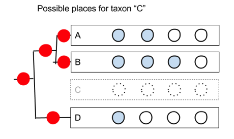
The problem is that we need to be able to generate all possible rearrangements for a given number of taxa. In the example above, if we move taxon C, there are five possible positions it could go on the remaining subtree:

2 But if we simply shuffle the order of the taxa we can’t generate all the trees. However, if we remember that we also have the internal nodes, then there is a simple way we can generate the trees. 1 When we draw a tree each row corresponds to a node. The gap between each pair of leaves (the taxa A,B,D) corresponds to the an internal nodes. So we could divide the drawing up into “hit zone”, so that if you drag the taxon we’re adding (“C”) onto the zone centred on a leaf, we add the taxon below that leaf; if we drag it onto a zone between two leaves, we attach it below that the corresponding internal node. From the user’s point of view they are still simply sliding taxa up and down, but in doing so we can create each of the possible trees.

We could implement this in a Web browser with some Javascript to handle the user moving the taxa, and draw the corresponding phylogeny to the left, and quickly update the (say, parsimony) score of the tree so that the user gets immediate feedback as to whether the rearrangement they’ve made improves the tree.

I think this could be a fun teaching tool, and if it supported touch then students could use their phones and tablets to get a sense of how tree building works.

Saturday, September 22, 2012

Touching the tree of life

Prompted by a conversation with Vince Smith at the recent Online Taxonomy meeting at the Linnean Society in London I've been revisiting touch-based displays of large trees. There are a couple of really impressive examples of what can be done.

Perceptive Pixel


I've blogged about this before, but came across another video that better captures the excitement of touch-based navigation of a taxonomy. Perceptive Pixel's (recently acquired by Microsoft) Jeff Han demos browsing an animal classification. The underlying visualisation is fairly sttaightforward, but the speed and ease with which you can interact with it clearly makes it fun to use.

DeepTree


DeepTree comes from Life on Earth lab, and there's a paper coming out by @blockflorian and colleagues (I was reminded of this project by @treevisproject):


For technical details on the layout algorithm see https://lifeonearth.seas.harvard.edu/downloads/DeepTree.pdf. Below is a video of it in use:


Both of these are really nice, but what I really want is to have this on my iPad…

Tuesday, August 31, 2010

Viewing scientific articles on the iPad: Mendeley

Previously I've looked at the Nature, PLoS, and Papers apps, now it's the turn of the Mendeley iPad app. As before, this isn't a review of the app as such, I'm more interested in documenting how the app interface works, with a view to discovering if there are consistent metaphors we can use for navigating bibliographic databases.

Perhaps the key difference between Mendeley and the other apps is that Mendeley is cloud-based, in that the bibliography exists on Mendeley's servers, as well as locally on your desktop, iPad, or iPhone. Hence, whereas the Nature and PLoS apps consume a web stream of documents, and Papers enables you to sync collections between desktop and iOS devices, Mendeley syncs to central web server. At present this appears to be done over HTTPS. Mendeley recently released an API, which I've discussed at length. Mendeley's app doesn't use this API, which is a pity because if it did I suspect the API would be getting the love it needs from Mendeley's developers.

Like Papers, the Mendley app uses a split view, where the left-hand panel is used for navigation.

mendeley.png

You can drill down to lists of references, and display basic details about an article.

PDF
The Mendeley app is a PDF viewer, but whereas the PLoS app has page turning, and the Papers app scrolls pages from left to right, the Mendeley app displays PDF pages vertically (which is probably the more natural way to scroll through content on the iPad):

touch6.jpg

Summary
It's clearly early days for the Mendeley app, but it's worth noting two of its most obvious limitations. Firstly, it depends entirely on the user's existing Mendeley bibliography - you can't add to this using the app, it's simply a viewer. Compare this to Papers which can access a suite of search engines from which you can download new papers (albeit with some limitations, for example the Papers iPad app doesn't seem to support extracting metadata via XMP, unlike the desktop version). Secondly, despite Mendeley having as one of its goals being a
research network that allows you to keep track of your colleagues' publications, conference participations, awards etc., and helps you discover people with research interests similar to yours

the Mendeley app lacks any social features, apart from sharing by email(!). I think designing social interactions in bibliographic apps will be a challenge. For an example of what social reading can look like, check out Flipboard.

Viewing scientific articles on the iPad: Papers

ipad_iphone.gifContinuing the series of posts about reading scientific articles on the iPad, here are some quick notes on perhaps the most polished app I've seen, Papers for iPad. As with earlier posts on the Nature and PLoS apps, I'm not writing an in-depth review - rather I'm interested in the basic interface design.

Papers is available for the Mac, as well as the iPhone and iPad. Unlike social bibliographic apps such as Zotero and Mendeley, Papers lacks a web client. Instead, all your PDFs are held on your Mac, which can be wirelessly synced with Papers on the iPad or iPhone.

Navigation popover

Papers makes extensive of use of the split view, in which the screen is split into two panes, the left-hand split becoming a popover when you hold the iPad in porrtait orientation. Almost all of the functionality of the iPhone version is crammed into the left-hand split. The popover displays the main interface categories (library, help, collections that you've put PDFs into), collections of documents, metadata for individual papers (which you can edit), as well as search results from a wide range of databases:

papers.jpg

Some of these features you encounter as you drill down, say from library to list of papers, to details about a document, others you can access by clicking on the tab bar at the bottom.

PDF display
Like the PLoS app, Papers displays PDFs. It doesn't use a page-turning effect, rather you swipe through the pages from left to right, with the current page indicated below in a page control (what Sencha Touch describe as a carousel control).

touch5.jpg

Given that the document being displayed is a PDF there is no interaction with the images or citations, but you can add highlights and annotations.

Summary
Papers is the first of the iPad apps I've discussed that isn't limited to a single publisher. If and article is online, or in your copy of Papers for the Mac, then you can view it in Papers for iPad. It is the app that I use on a day to day basis, although the PDF viewer can feel a little clunky. I think anyone designing an application reader should play with Papers for a while, if only to see the level of functionality that can be embedded in the basic iPad split view.

Monday, August 23, 2010

Viewing scientific articles on the iPad: towards a universal article reader

There are a growing number of applications for viewing scientific articles coming out for the iPhone and iPad. I'm toying with extending the experiments described in an earlier post when I took the PLoS iPad app to task for being essentially a PDF page-turner, so I thought I should take a more detailed look at the currently available apps. In particular, I'm interested in how the apps solve some basic tasks, and whether there is a consistent "vocabulary" for interacting with an article. Put less pretentiously, do the apps display things such as lists of articles, citations, references, figures, and bibliographic data in similar ways, or does the user have to learn new rules for each app? I'm also interested in how the apps treat the article (e.g., as a monolithic PDF, as a document with pages, or as a web document where pagination has no meaning), and how they get their content (from a publisher, from the user's social network, from the user's personal library).

Nature
In this post I'm going to look at Nature.com's app. Future posts will explore other apps. I'm interested in what people have done so far, and how we could improve the reading experience. Long term I'm interested in whether there's scope for a "universal article reader" that can take diverse formats (including XML, PDF, and page images) and display them in a consistent and useful way. In the diagrams below I'm using touch gesture symbols from Graffletopia (see Touch Gesture Reference Guide).


Contents
Nature's app is limited to articles published by Nature, and displays the available articles as a list with thumbnails of a figure from the article. The app fetches this list using Nature's mobile API. Up until April 30th the fulltext of an article was free, at at present you are limited to getting abstracts. It's interesting that the list of articles isn't retrieved using a RSS feed, I presume because Nature wanted to use some simple authentication to avoid users downloading all their closed-access content for free.

touch1.jpg

Article display
Nature's app, unlike all the others I've seen so far, doesn't use PDFs. Instead it uses ePub. Unlike many ePub book readers (including Apple's own iBooks), the Nature app doesn't render the article as a series of pages, but as one continuous document that you scroll down by dragging (it's essentially a web page). You can't zoom the text, but the text size is fine for reading.

touch2.jpg

Citations
Citations in the body of the article are links. If you tap them the full citation slides in from the right, with a link to the publisher's website. If you tap the link the app opens the website within the app. This can be a little jarring as you move from a customised view of an article to a web page designed for a desktop. In the case of a Nature article, it would be more elegant if the app recognised that the cited reference was a Nature article and rendered it natively in the app. More generally the transition between app and website might be less jarring if journal publishers developed mobile versions of their websites.

touch3.jpg


Figures
The figures aren't displayed directly in the body of the article, but each mention of a figure in the body of the text is a link. Tapping the link causes the figure to slide up from the bottom of the screen. A button in the top right hand corner enables you to toggle between displaying the figure and it's caption (shown as white text on a black background). You can use pinch and spread to zoom in and out of the figure, as well as save it to the photo library on your device.

touch4.jpg


Summary
I've started with the Nature app as I think it's the only one so far to seriously tackle the challenge of displaying an article on a mobile device. Instead of displaying PDFs it repackages the articles in ePub format and the result is much more interactive than a PDF.

I hope to explore other article viewing apps in later posts, but it's worth noting that we should also be looking at other apps for ideas. Personally I really like the Guardian's iPhone app, which I use as my main news reader. It has a nice gallery feature to display thumbnails of images (imagine a gallery of an article's figures), and uses tags effectively.