Some quick notes on interface ideas for digital libraries and/or knowledge graphs.
Recently there’s been something of an explosion in bibliographic tools to explore the literature. Examples include:
- Elicit which uses AI to search for and summarise papers
- _scite which uses AI to do sentiment analysis on citations (does paper A cite paper B favourably or not?)
- ResearchRabbit which uses lists, networks, and timelines to discover related research
- Scispace which navigates connections between papers, authors, topics, etc., and provides AI summaries.
As an aside, I think these (and similar tools) are a great example of how bibliographic data such as abstracts, the citation graph and - to a lesser extent - full text - have become commodities. That is, what was once proprietary information is now free to anyone, which in turns means a whole ecosystem of new tools can emerge. If I was clever I’d be building a Wardley map to explore this. Note that a decade or so ago reference managers like Zotero were made possible by publishers exposing basic bibliographic data on their articles. As we move to open citations we are seeing the next generation of tools.
Back to my main topic. As usual, rather than focus on what these tools do I’m more interested in how they look. I have history here, when the iPad came out I was intrigued by the possibilities it offered for displaying academic articles, as discussed here, here, here, here, and here. ResearchRabbit looks like this:
Scispace’s “trace” view looks like this:
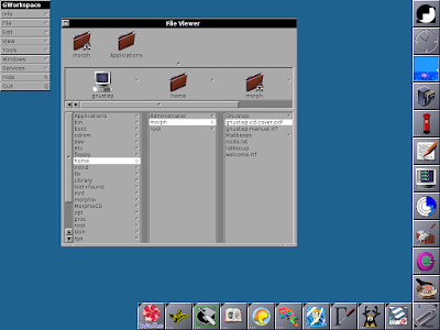
What is interesting about both is that they display content from left to right in vertical columns, rather than the more common horizontal rows. This sort of display is sometimes called Miller columns or a cascading list.
By Gürkan Sengün (talk) - Own work, Public Domain, https://commons.wikimedia.org/w/index.php?curid=594715
I’ve always found displaying a knowledge graph to be a challenge, as discussed elsewhere on this blog and in my paper on Ozymandias. Miller columns enable one to drill down in increasing depth, but it doesn’t need to be a tree, it can be a path within a network. What I like about ResearchRabbit and the original Scispace interface is that they present the current item together with a list of possible connections (e.g., authors, citations) that you can drill down on. Clicking on these will result in a new column being appended to the right, with a view (typically a list) of the next candidates to visit. In graph terms, these are adjacent nodes to the original item. The clickable badges on each item can be thought of as sets of edges that have the same label (e.g., “authored by”, “cites”, “funded”, “is about”, etc.). Each of these nodes itself becomes a starting point for further exploration. Note that the original starting point isn’t privileged, other than being the starting point. That is, each time we drill down we are seeing the same type of information displayed in the same way. Note also that the navigation can be though of as a card for a node, with buttons grouping the adjacent nodes. When we click on an individual button, it expands into a list in the next column. This can be thought of as a preview for each adjacent node. Clicking on an element in the list generates a new card (we are viewing a single node) and we get another set of buttons corresponding to the adjacent nodes.
One important behaviour in a Miller column interface is that the current path can be pruned at any point. If we go back (i.e., scroll to the left) and click on another tab on an item, everything downstream of that item (i.e., to the right) gets deleted and replaced by a new set of nodes. This could make retrieving a particular history of browsing a bit tricky, but encourages exploration. Both Scispace and ResearchRabbit have the ability to add items to a collection, so you can keep track of things you discover.
Lots of food for thought, I’m assuming that there is some user interface/experience research on Miller columns. One thing to remember is that Miller columns are most often associated with trees, but in this case we are exploring a network. That means that potentially there is no limit to the number of columns being generated as we wander through the graph. It will be interesting to think about what the average depth is likely to be, in other words, how deep down the rabbit hole will be go?
Update
Should add link to David Regev's explorations of Flow Browser.
Written with StackEdit.
