 I've just come back from II Iberian Congress of Biological Systematics (CISA2013) in Barcelona, where I had a great time. I gave a presentation on biodiversity informatics entitled "Biodiversity informatics: why aren't we there yet?". Instead of my usual complaining about what a disaster biodiversity informatics is, and how links are so important (etc., etc.) I tried something a little new and presented a series of charts and diagrams, together with some (not terribly well thought out) interpretations. What I had in mind in doing this was to ask the question "what do these charts tell us about the field?" or, put another way, "what, if anything, do these charts tell us we should be doing?". I envisaged someone in a company say, looking at charts on changes in the market (e.g., numbers of PCs versus laptops, mobile versus desktop Internet consumption, or peak oil) and thinking about what the implications are for their business. By this stage it should be clear I've no idea what I'm talking about, but I hope you get the idea. So, here are some of the charts I showed in my talk, together with some commentary.
Sequencing

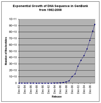
These two charts show that the cost of sequencing is plummeting, and the number of sequences going into GenBank is rising exponentially (note that the GenBank chart is old and predates the step-change in sequencing costs, so growth was exponential even before it became much cheaper). I realise that there is more to sequencing costs than the first chart implies (http://dx.doi.org/10.1186/gb-2011-12-8-125) but the bottom line is we have a flood of data.
Taxonomy

The rate of publication of new animal names has been roughly constant in the last few decades. Exactly what these sort of graphs mean is problematic, but my suspicion is that it reflects a discipline working at capacity. There is a limit to how many taxa it can describe, and I suspect a limit to the kinds of taxa being described (i.e., those that can be fairly easily recognised morphologically).
Dark taxa
So we have exponential growth of sequence data coupled with taxonomic output that is essentially flatlining. Perhaps then it's no surprise that we have dark taxa in GenBank (i.e., taxa that don't carry proper Linnaean names):

This chart shows the declining number of "invertebrate" taxa in GenBank that have proper scientific names. Unfortunately, it is not trivial to figure out whether these dark taxa represent previously undiscovered biodiversity (i.e., new species) or taxa that have already been described but which we are either unable or unwilling to identify. In any event, exponential growth versus flat line means there is a disconnect between genomics and taxonomy.
The literature gap
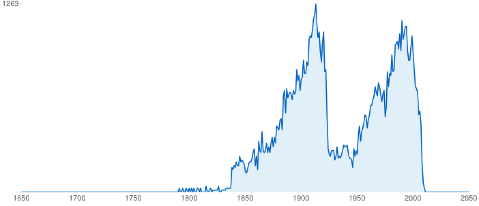
This chart (from BioStor) highlights two things. Firstly, the Biodiversity Heritage Library is not just about old (i.e., pre-1923) literature. Despite that, 1923 is a mass extinction event in terms of access to taxonomic literature. If we date modern open access as getting underway around 2003 (the birth of PLoS) then we have a period of time (1923-2003) where much of the literature about biodiversity is "dark", either not digitised or locked behind a paywall. Some museums and scientific societies are opening up their publications (this is mostly what comprises the second peak in the chart), but much of the 20th century literature is closed to us.
Long tails
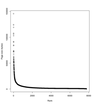
One reason the legacy literature matters is the "long tail" phenomenon. Above is a plot of the size of Wikipedia articles for mammals, where the pages are ranked from largest to smallest. A few mammals have really detailed pages, the vast majority of mammals have small pages ("stubs"). So for most taxa we know only a little, and hence the most recent publication on those taxa might be quite old. This means that if we want to build comparative databases we will need the legacy literature.
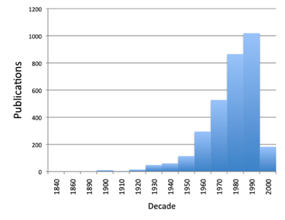
The chart below is a plot of the dates of publication of the sources used by the PanTHERIA database. Many of these are in the gap between 1923 and 2003, and a few date back to the 19th century. Even for a well-studied group such as mammals, the old literature matters.
Who publishes taxonomy?
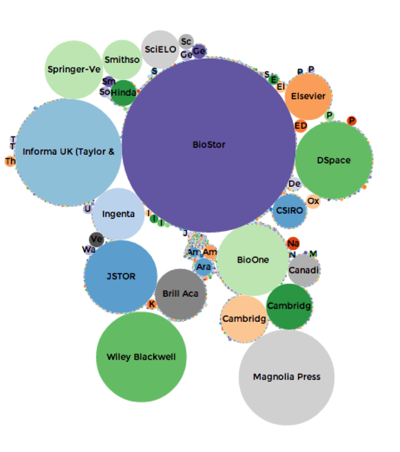
Based on data in BioNames the chart above shows the relative importance of different publishers in terms of how many articles describing new animal taxa they have published. BioStor, which harvests articles from BHL, is the single largest source, which emphasises how important BHL is (all its content is open access). There are some significant commercial publishers (Springer, Elsevier, Taylor and Francis, BioOne) who we would need to talk to about data mining. There is also a huge long tail (hard to see but represented by all the tiny dots) of very small journals that collectively publish quite a lot of taxonomy.
But one thing that is striking about modern animal taxonomy is the emergence of Zootaxa as a "mega journal". The chart below shows time lines of articles-per-decade for the major taxonomic journals in zoology. There is a colossal spike that is Zootaxa. So, if we are interested in data mining at scale Zootaxa looks like the place to start.

Where is the biodiversity?
GBIF makes some wonderful maps, like the one below. But it's worrying that it seems to bear more relation to economic development than where the actual biodiversity is. The Amazon basin barely registers, Africa is poorly covered (not to mention China) and there are obvious sampling tracks in the oceans.
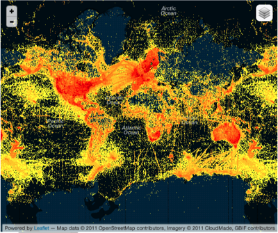
Maybe crowd sourcing ("citizen science") can come to the rescue? Not so much if this next map is representative. It shows the distribution of photos in the EOL group on Flickr. This looks more like a map of where the iPhones are, rather than where the biodiversity is. If the crowd has the same economic and geographic bias as the experts, then it's not going to help us much.

GenBank as a biodiversity database

Another "crowd" are people doing sequencing and depositing georeferenced sequences in GenBank. Many of these are DNA barcodes, but some of it is simply well-documented sequence data. A map of animal DNA sequences from GenBank reveals a map (above) that is sparser than GBIF, and shares many of the same biases, but this map and the next diagram make me wonder whether it is useful to take another look at GenBank's role.

GenBank has a lot more information than just sequences. Many accessions have geographic information, as well as other useful data such as "host" associations (e.g., for parasites or other close ecological relationships). I played with this a while ago, and found some interesting patterns. Given that GenBank has taxonomy, some geography, and some ecology, and we can compute phylogenetic relationships on the sequence data it could enable a richer biodiversity database than GBIF. Put another way, if we were to build a GBIF-style database on top of GenBank data, what would we do differently?
Data is private
This is a diagram that I published a few years ago http://dx.doi.org/10.1038/npre.2007.1028.1 that showed the gap between published papers on molecular phylogenetics and the number of phylogenies that made their way into TreeBASE. I can't help thinking that this tells us something about what we actually think of the value of individual phylogenies (i.e., they are relatively disposable). This is not to say that phylogenies don't matter, just that any individual phylogeny is relevant for a shorter period of time than the data (e.g., DNA sequences) used to infer that phylogeny.

Summary
This is a small, very biased collection of diagrams. There are obviously other diagrams that could be created, and some much more sophisticated analyses that we could do to try and tease out some more implications. In this post I'm largely waving my arms about. But I think it might be useful to explore this further and try and ask some questions about where we are, and where we are going. Or, more to the point, what we should be doing right now.